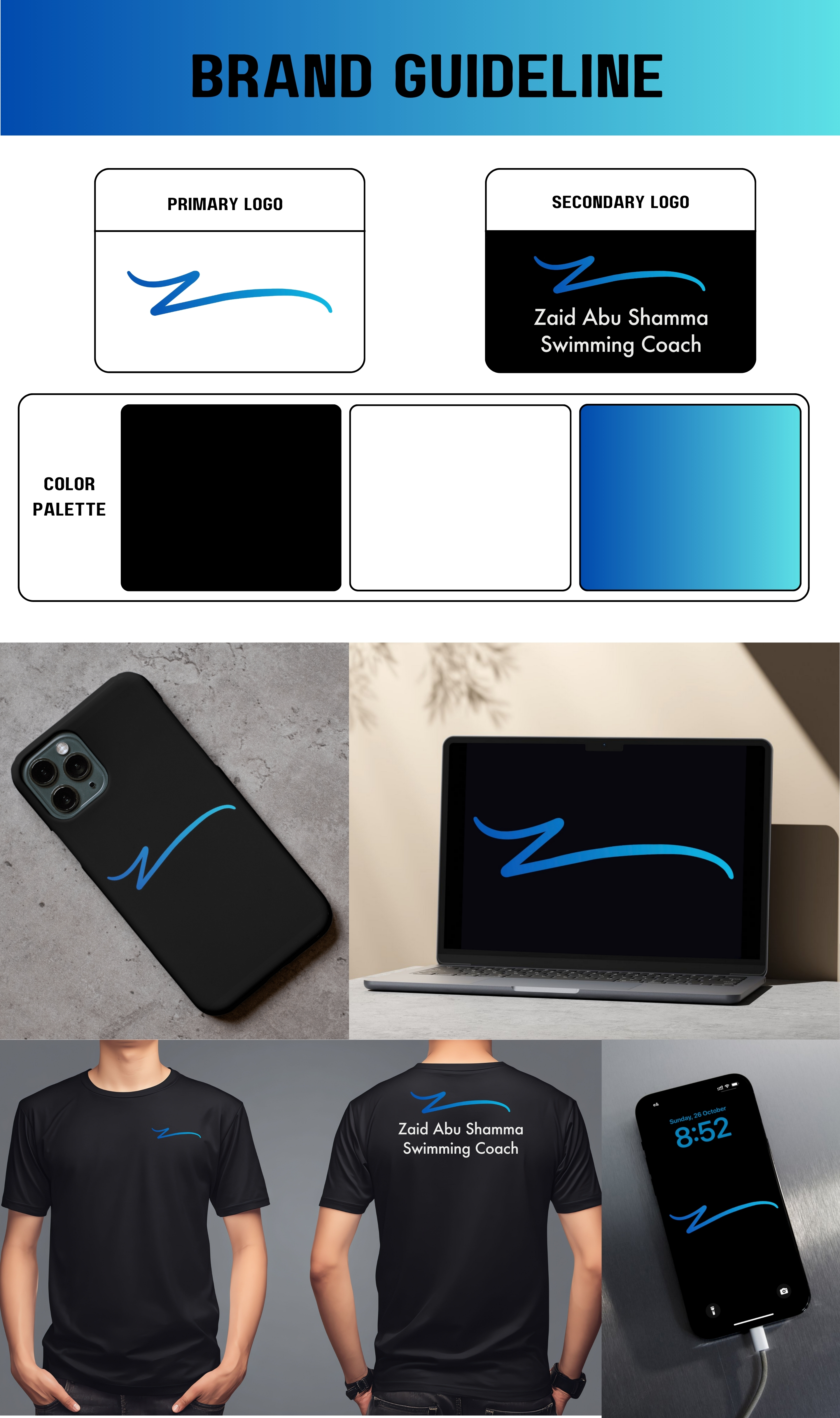
Brand Identity Reveal for Coach Zaid
The concept behind the logo is built on movement, energy, and clarity:
The fluid motion in the icon symbolizes the natural flow of swimming — graceful, continuous, and full of momentum.
The gradient blues reflect clarity, calmness, and strength, capturing the spirit of Coach Zaid’s coaching philosophy and the confidence he aims to build in every swimmer.
The overall design blends professionalism with a modern, athletic touch, creating a memorable identity that truly represents his brand.
Check out my LinkedIn and Instagram accounts to find out more information about that project.
